p95 vs p99 Latency Explained
p95 vs p99 latency is one of those topics that seems technical and abstract until a system gets slow in production and the average still looks fine. Then it becomes very practical very quickly. Teams ask why dashboards said performance was acceptable while users were clearly frustrated. The usual answer is that averages hid the long tail.
Percentiles solve that visibility problem. They show how bad latency gets for slices of traffic rather than compressing everything into one mean value. p95 tells you how the slower end of most requests behaves. p99 tells you how the extreme tail behaves. Neither metric is perfect on its own, but together they help you understand whether performance is stable or whether a small but meaningful share of users is experiencing much worse latency than the average suggests.
This matters in load testing, incident response, SLO design, release gating, and capacity planning. If your team only looks at average response time, it will miss many of the issues that actually affect user experience. This guide explains what p95 and p99 mean, how percentiles work, when to use each one, and how to apply them in real load testing workflows. To connect the concepts back to implementation, also read What Is Load Testing?, How to Load Test an API, and Load Testing in CI/CD.
What latency percentiles actually mean
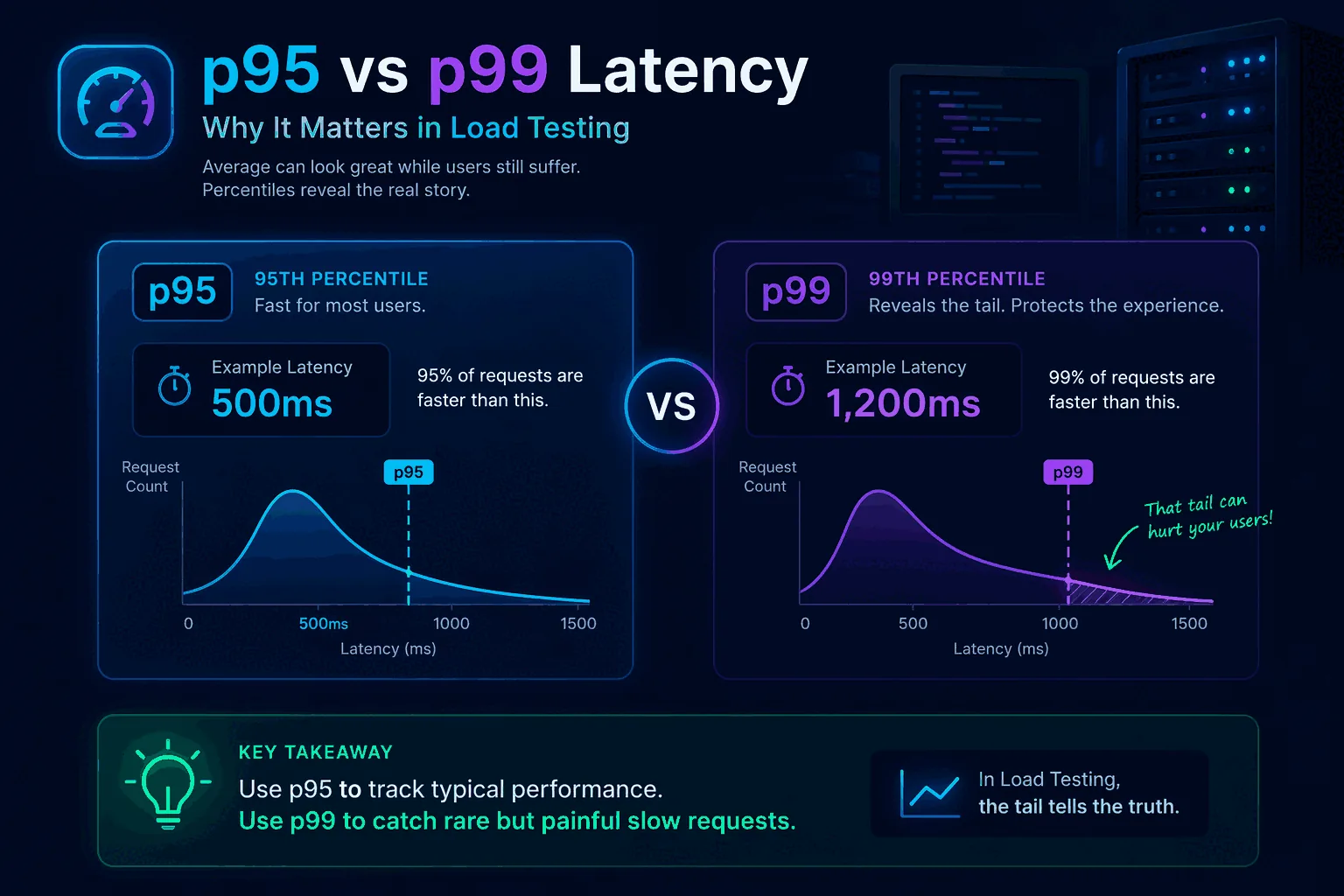
A percentile tells you the value below which a certain percentage of observations fall.
If your API has a p95 latency of 400 milliseconds, that means 95 percent of requests completed in 400 milliseconds or less, and the slowest 5 percent took longer than that.
If the same API has a p99 latency of 1.2 seconds, that means 99 percent of requests completed in 1.2 seconds or less, and the slowest 1 percent took longer than that.
This is different from an average. An average combines all latencies into one mean number. That mean can look healthy even when a minority of requests are painfully slow. Percentiles preserve more of the shape of the distribution.
Think of a checkout API where most requests finish in 150 milliseconds, but one out of every hundred spikes to 2 seconds because of a downstream lock or database issue. The average might still look good enough to pass a superficial check. The p99 will show you the real pain.
That is why percentile thinking is central to useful performance testing. It helps you measure not just central tendency but user-facing consistency.
Why average latency is not enough
Average latency is not useless. It can be a helpful summary when the distribution is stable and narrow. The problem is that real systems often do not behave that way.
Latency distributions are frequently skewed. Most requests may be fast while a smaller set becomes slow because of cache misses, contention, cold starts, network variance, large payloads, noisy neighbors, downstream saturation, or expensive query paths. In those cases, the average tells you less than you think.
Here is a simple mental model. Imagine 100 requests. Ninety-nine complete in 100 milliseconds. One takes 5 seconds. The average is about 149 milliseconds. That average sounds fine in many dashboards. But for the user who hit the 5-second outlier, the experience was terrible. If those outliers happen on checkout, login, search, or another important path, they matter a lot.
This is one reason articles like Website Load Testing vs API Load Testing and GraphQL Load Testing matter. Different system layers and query shapes can create very different tails even when average performance appears acceptable.
Averages answer “how fast on average?” Percentiles answer “how bad for the slower edge of traffic?” In production, that second question is often more useful.
Understanding p50, p90, p95, p99, and max
It helps to see p95 and p99 in the wider family of latency metrics.
p50 is the median. Half of requests are faster, half are slower. This gives a sense of the typical request but says little about the tail.
p90 shows the threshold for the slowest 10 percent. It is a gentler tail metric and often useful for broad service health.
p95 is a common balance point. It tells you how the slower edge of most traffic behaves without becoming overly sensitive to tiny sample counts. Many teams use p95 in dashboards, alerts, and load testing thresholds.
p99 focuses on the more extreme tail. It is useful for uncovering issues that affect a smaller slice of traffic but may still be operationally or commercially important.
max tells you the worst observed request. It can be interesting, but it is often too noisy to drive decisions by itself because one rare anomaly can dominate the number.
These metrics work best together. p50 tells you the typical experience. p95 shows whether the slower end of normal traffic is still acceptable. p99 shows whether the extreme tail is becoming unhealthy. Max provides context but should usually be interpreted cautiously.
The difference between p95 and p99 in plain English
A practical way to explain the difference is this:
- p95 asks, “How bad does latency get for the slower slice of normal traffic?”
- p99 asks, “How bad does latency get for the very worst regular outliers?”
If p95 and p99 are both close to p50, the system is consistent. Most users are getting roughly the same experience.
If p95 is okay but p99 is much worse, the system has tail instability. Most requests may be fine, but rare paths, cache misses, lock contention, or downstream dependencies are creating painful outliers.
If both p95 and p99 are rising as load increases, the system is broadly degrading and not only suffering from rare edge cases.
This is why you should not treat p95 and p99 as competitors where only one can be useful. They answer different questions about the same system. The right choice depends on what risk you are trying to understand.
Why p95 is so commonly used
p95 is popular because it offers a strong balance between usefulness and stability. It captures the slower edge of user experience without being as sensitive to very small outlier slices as p99 can be.
For many product teams, p95 is the best first percentile to watch because it is easier to explain and easier to stabilize in alerts, tests, and SLOs. If your p95 stays healthy under realistic load, most users are likely having an acceptable experience.
It is also a good threshold for CI/CD guardrails. Suppose your search API normally has p95 latency of 250 milliseconds in staging under a baseline workload. You might define a threshold that fails a performance regression test if p95 crosses 350 or 400 milliseconds under the same conditions. That catches broad slowdowns without being overly triggered by one or two odd requests.
p95 also works well for service comparisons because it is usually based on enough traffic to be statistically meaningful even in smaller test windows. That makes it practical for routine engineering use.
Why p99 still matters
p99 matters because some of the worst production pain lives in the last 1 percent.
That last 1 percent may include:
- cache misses that hit cold backends
- lock contention during writes
- heavy GraphQL query shapes
- large payload serialization
- slow third-party dependency calls
- noisy neighbor issues
- rare but important database plans
- garbage collection pauses or runtime hiccups
If you only watch p95, you may miss or underestimate these tail events. That becomes dangerous when the slow tail affects critical user journeys. A 1 percent failure or near-failure rate can still represent a lot of unhappy customers at scale.
p99 is especially valuable when you are debugging intermittent slowness, analyzing risk in high-throughput systems, or protecting premium flows where even small fractions of bad experience matter. It is also helpful for identifying architectural instability that averages and p95 can partially smooth over.
The trade-off is that p99 can be noisier, especially with low traffic or short test windows. That does not make it less valuable. It just means you should interpret it with context.
When to prioritize p95
Use p95 as your primary latency metric when you want a robust, practical view of service performance for most users.
It is particularly useful for:
- routine dashboarding
- load testing thresholds
- release comparisons
- CI/CD smoke and baseline checks
- service-level conversations across broad teams
- initial capacity planning
If your team is still new to percentile thinking, p95 is often the best starting point because it is easier to socialize. It helps teams move beyond averages without immediately jumping into the most volatile tail metric.
For example, if you are introducing performance checks into your pipeline, a p95 threshold is often the cleanest first guardrail. It lets you catch meaningful regressions while keeping noise manageable. See Load Testing in CI/CD for how to structure that workflow.
When to prioritize p99
Use p99 when tail behavior is strategically important.
That includes:
- debugging intermittent latency spikes
- protecting checkout, login, or other critical flows
- analyzing systems with bursty or highly variable query cost
- evaluating premium or enterprise user experience
- investigating downstream dependency instability
- tuning caching and concurrency behavior
- operating at large enough scale that 1 percent is still a lot of traffic
GraphQL systems are a good example. Query cost can vary dramatically depending on field selection, nesting, and resolver behavior. In those environments, p99 often reveals pain that p95 does not fully surface. That is one reason GraphQL Load Testing should be paired with percentile analysis.
p99 is also useful in systems where rare slow requests create cascading side effects such as queue buildup, retries, timeouts, or connection pool pressure. The tail may be small in percentage terms but large in operational impact.
p95 vs p99 in load testing
In load testing, p95 and p99 should both influence how you interpret results, but they do not always play the same role.
p95 is often the best primary pass/fail threshold because it reflects the experience of the slower slice of most traffic and is stable enough for repeated comparisons. If a service’s p95 degrades materially under a realistic workload, you likely have a broad performance problem.
p99 is often the best diagnostic and risk metric. It tells you whether the tail is stretching in concerning ways even when most traffic still looks healthy. A widening gap between p95 and p99 often signals growing instability.
For example, suppose two test runs show similar averages. In run A, p95 is 300 milliseconds and p99 is 450 milliseconds. In run B, p95 is 320 milliseconds and p99 is 2 seconds. The averages may look close, but run B is clearly riskier. Tail behavior is deteriorating even though the broad center looks acceptable.
This is why a good test report should not stop at average and throughput. It should show percentile shape clearly. This applies whether you are testing APIs, websites, or GraphQL backends.
Percentiles and user experience
Percentiles matter because users do not experience averages. They experience their own request.
If your product is a dashboard, p95 may be a strong proxy for whether most people feel the app is responsive. If your product includes a checkout or booking step, p99 may matter much more because rare slowness on a high-stakes action has outsized business impact.
In website contexts, remember that backend latency is only part of the total experience. Frontend rendering, asset loading, and client-side work also matter. That is why it helps to separate backend load testing from full user experience thinking, as discussed in Website Load Testing vs API Load Testing.
Still, backend latency percentiles are one of the clearest ways to connect system performance to user impact. They help you ask, “How many users are exposed to poor performance, and how poor is it?”
Percentiles and SLOs
Service Level Objectives often use percentiles because they express experience quality better than averages.
For example, an SLO might say:
- 95 percent of requests should complete within 300 milliseconds
- 99 percent of requests should complete within 1 second
That is a percentile-based promise. It allows for some variance while still protecting overall user experience.
The right percentile depends on the nature of the service. Broad internal APIs may use p95 for operational simplicity. Customer-facing critical transactions may use p99 or combine multiple targets.
The important thing is to align the percentile with the actual business risk. Do not choose p99 just because it sounds strict. Do not choose p95 only because it is common. Choose the percentile that best reflects the user harm you want to prevent.
Percentiles in CI/CD and regression testing
When teams start adding performance checks to CI/CD, percentiles become much more practical than raw max latency and much more honest than averages.
A simple pattern looks like this:
- use p95 as the primary threshold for routine regression gates
- track p99 alongside it for tail visibility
- compare both against a stable baseline under repeatable workload conditions
For example, you might allow a small p95 increase after a feature change but treat a large p99 spike as a warning that needs investigation. This is especially helpful in systems where new code introduces occasional expensive paths rather than broad slowdown.
CI/CD thresholds should be conservative and realistic. If you set them based on noisy environments or tiny sample sizes, percentiles can become frustrating. But with stable workloads and enough requests, they provide a powerful safety net.
This is one reason continuous performance practices work better than one-off benchmarks. Repetition makes percentile trends meaningful.
Common mistakes when using p95 and p99
The first mistake is treating percentiles as isolated numbers without understanding the workload. A p95 of 400 milliseconds may be excellent or terrible depending on the operation, the user expectation, and the traffic mix.
The second mistake is comparing percentiles across different workloads and environments as if they were directly equivalent. A test is only comparable when the traffic model, data state, and environment are comparable.
The third mistake is using p99 with too few samples. If you only have a small number of requests, the p99 may not be stable enough to guide decisions.
The fourth mistake is ignoring the gap between p95 and p99. That gap often tells you whether the tail is under control or stretching.
The fifth mistake is relying on percentiles alone without backend observability. Percentiles tell you that user experience changed. They do not explain why. You still need logs, traces, saturation metrics, and service-level telemetry.
The sixth mistake is forgetting that GraphQL and complex APIs can hide multiple performance profiles behind one endpoint. Percentiles become more useful when combined with operation-specific breakdowns.
Example: how p95 and p99 can tell different stories
Imagine an API under moderate load.
Run one:
- average: 180 milliseconds
- p95: 260 milliseconds
- p99: 320 milliseconds
Run two:
- average: 190 milliseconds
- p95: 270 milliseconds
- p99: 1.8 seconds
If you focus only on average or even only on p95, the runs look similar. But the p99 tells you something serious changed in the tail. Perhaps a small subset of requests now hits a slow downstream service or a poorly indexed query plan.
Now imagine run three:
- average: 280 milliseconds
- p95: 700 milliseconds
- p99: 1.2 seconds
This is a different pattern. Here the whole slower edge of the distribution is degrading, not just the extreme tail. That suggests broader saturation, underprovisioning, or a more systemic slowdown.
This is why p95 and p99 together are so useful. They help you see whether your problem is broad degradation or tail instability.
How to explain percentiles to non-engineers
You do not need a statistics lecture. Use plain language.
A good explanation is:
- p95 tells us how fast the system is for almost all users
- p99 tells us how bad the rare worst cases are
- averages can look fine even when a meaningful number of users are having a bad experience
You can also frame it like a delivery promise. If a courier says the average delivery time is one day, that sounds good. But if 1 percent of packages take two weeks, that matters a lot for urgent orders. p99 helps you see that tail risk.
This simpler framing helps product managers, executives, and non-specialists understand why a release might be blocked even when “the average latency only went up a little.”
Which should you watch: p95 or p99?
The honest answer is: usually both, but for different reasons.
Watch p95 as your main operational and regression metric for many services. It gives a strong read on the slower edge of most traffic and is practical for repeated comparisons.
Watch p99 when tail risk matters, when you are debugging, or when a small percentage of slow requests still translates into meaningful user pain or operational danger.
If you force yourself to choose only one, most teams should start with p95 because it is broadly useful and easier to stabilize. But do not stop there for critical systems. Tail behavior is too important.
A simple percentile policy most teams can adopt
If your team is still arguing about which percentile matters, adopt a simple rule instead of waiting for the perfect framework. Use p95 as the default headline metric for service health and release regression checks. Use p99 as the escalation metric for critical user paths, latency-sensitive systems, and incident reviews.
That policy keeps dashboards readable while still protecting against the kind of tail behavior that damages user trust. It also makes conversations with product and operations much easier, because everyone knows which percentile drives the routine decision and which one signals deeper risk.
The exact numbers will vary by system. What matters is choosing a rule, documenting it, and applying it consistently across releases and investigations.
Final thoughts
p95 vs p99 latency is not an academic debate. It is a way of deciding how honestly you want to see performance.
If you only watch averages, you will miss too much. If you watch p95, you will understand how the slower edge of normal traffic behaves. If you watch p99, you will see whether the tail is stretching into user pain or operational instability.
The best teams use both with context. They define realistic workloads, compare percentiles across stable environments, and connect the numbers back to actual user journeys. That is how latency metrics become decision tools instead of dashboard decoration.
Frequently asked questions
Should you alert on p95 or p99 in production?
Alert on p95 for primary SLOs and use p99 as a secondary signal, not as the gate. p95 is statistically stable enough to fire reliably without false positives at moderate request volumes. p99 is noisy on anything under a few thousand requests per minute, which makes it prone to flapping alerts. p99 is more useful as an investigation tool than as a paging trigger.
Why is the average latency such a misleading metric?
Because latency distributions are not symmetric. A long tail of slow requests pulls the average up but most requests are still fast, so the average looks 'okay' while a real fraction of users have a bad experience. A service with average latency of 80ms can still have a p99 of 2 seconds. The arithmetic mean is also vulnerable to a single outlier in a way that percentiles are not.
How many samples do you need before p95 and p99 are trustworthy?
For p95 to be reasonably stable, target at least a few hundred samples per measurement window. For p99, you need ten times that — a few thousand at minimum — and even then run-to-run variation can be high. Below those thresholds, treat the percentile as directional rather than precise. Running tests for longer rather than at higher rate is usually the right way to get more stable percentiles.